How to design logos for free
- What a logo really is
A logo is a small, visually recognizable representation of a brand. It should:
Convey the personality and purpose of the brand-the feeling that comes across.
Be memorable at a glance.
Works at many sizes and across different backgrounds and media.
Be simple enough to reproduce, flexible enough to adapt.
Logos aren’t just “pretty pictures”; they are means of recognition and building trust.
2) Core design principles
Keep these front-and-center while designing:
Simplicity: fewer elements = faster recognition and better scaling.
Distinctiveness: avoid clichés, unless you intentionally want them.
Scalability: must work at favicon size and on a billboard
Versatility: single-color, full-color, reversed (light/dark), horizontal & stacked variations.
Timelessness – design for years, not trends – but subtle modern touches are just fine.
Appropriateness – match the industry/audience expectations without being generic.
3) Free tools you can use-what they’re good at.
Everything here can be used without paid software-many have paid upgrades but the free tiers are powerful.
Inkscape is a free, open-source vector editor — SVG. Ideal for those who require a totally customized vector logo.
GIMP — free raster editor. Useful for mockups and bitmap editing.
Figma (Free plan) is a cloud-based vector/UI tool. Great for fast iterations and collaborations.
Canva (Free) – super amateur-friendly, lots of templates; not great for super detailed vector work, but awesome for quick comps.
Gravit Designer (Free / web) is a vector editor in a browser; good for when moving from a simpler editor into one offering more complexity.
Vectr (free) — a simple web vector editor.
Font resources: Google Fonts free, Font Library.
Free icon resources: The Noun Project free with attribution, Feather Icons, FontAwesome free subset.
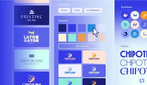
Color tools include: coolors.co – Free trial/Limited free, Material Palette, or just Google “color palette generator”.
Pick one as your primary editor Vector tool Inkscape, Figma, Gravit vectors = scalable logos
4) Step-by-step logo design process in detail
Follow this workflow. Each of the steps is actionable and can be done completely using free tools.
A. Discovery & brief (10–30 min)
In one sentence, define the brand: what they do, who they serve, and 1–2 adjectives-for example, “clean, techy, friendly”.
Q: Where will this logo appear most? App, Website, Print, Signage
Note constraints: color restrictions, must-include text, legal words, etc.
Deliverable: 1 sentence brand summary, 3 adjectives, 3 use-cases.
B. Research & inspiration 30-60 min
Look at competitors: what works, what’s common, what to avoid.
Create a mood board of images, colors, and type treatments that you like in Figma or Canva.
Identify 3 visual directions, for example: wordmark, pictorial mark, lettermark
Tip: Don’t copy-synthesize.
C. Drawing (30–90 min)
Start on paper. Quick thumbnail sketches, 30–100 tiny ideas.
Try: initials, simple icons, negative space, monograms, geometric markers.
Choose 6–12 of the strongest of these sketches and refine a bit.
Why sketch? It’s faster to test structure by hand than in software.
D. Digital exploration (1–3 hours)
Open a vector editor – either Inkscape or Figma.
Recreate top sketches as vector shapes Work in black and white first
Make a horizontal version and a stacked/square version.
Don’t add color yet-just judge by shape, contrast, balance.
E. Typography & lockups (30–60 min)
Test fonts matching your adjectives using Google Fonts or free font sites.
Consider custom letter tweaks: kerning, removing/addition of bits to make the wordmark unique.
Variations to make: logo with full name, logo with short name, icon alone.
F. Color exploration (30–60 min)
Key: Set 1 primary color + 1–2 accent colors + neutrals – black, white, gray
Test color contrast and color-blind friendliness.
Also produce single-colour version: black on white, white on black.
G. Testing & mockups (30–90 min)
Test on real contexts: favicon, mobile app icon, website header, business card, T-shirt mockup.
Scale down to 16×16 or 32×32 and ensure legibility.
If possible, print a small, black-and-white version for testing reproduction.
H. Feedback & iteration (as needed)
Get 3–5 neutral responses: clarity, personality fit, readability.
Adjust shape, spacing, or font based on feedback provided.
I. Final deliverables & exporting
Save as vector master (SVG or PDF)
Export PNGs in different sizes: favicon 32×32, social avatar 512×512, etc.
Deliverables: full-colour horizontal PNG, full-colour stacked PNG, white-on-dark PNG, single-colour PNG/SVG, and a small monochrome favicon.
Create a simple brand usage note: colors, font, and spacing.
5) Practical design tips — typography, color, spacing
Type pairing: One primary display/brand font, one neutral secondary. No more than two display fonts
Kerning & optical spacing: Adjust letter spacing for harmony by hand-automatic kerning usually needs adjustment.
Grid and geometry: Employ simple grids-circle, golden ratio, or modular grid-to align and balance elements.
Negative space: Clever negative space can create memorable marks-but keep it legible.
Color psychology: Blue = trust, red = energy/urgency, green = nature/health, etc. Don’t rely only on rules of thumb – match to the brand.
Contrast: Ensure readability; test on low-contrast screens and as grayscale.
6) File formats & when to use them
SVG-perfect for web and the master scalable format. When sharing widely, text should remain converted to outlines.
PDF — good for print vector exports.
PNG — raster with transparency; use for web where SVG not supported (export at multiple sizes)
JPEG – avoid for logos (no transparency); ok for mockups on photographic backgrounds
EPS — A legacy print vector format. Good if a printer requests it.
Always maintain a vector master (SVG/PDF) — you’ll thank yourself later.
7) Licensing of free-fonts & icons — beware
Use fonts/icons labeled free for commercial use. Google Fonts is safe.
For a free tool or icon that requires attribution, include it in your assets or replace with an attribution-free item for clients.
Don’t use copyrighted images, or stock with restricted licenses, without permission.
8) Ease of access & real-world testing
Ensure sufficient contrast between the logo and background (WCAG-style thinking).
Test for colour-blindness (tools or just simulate by desaturating).
Check legibility at tiny sizes and on mobile screens.
9) Templates & common logo types
Wordmark: a brand name styled — e.g., Google. Good for unique names.
Lettermark — initials, for example, IBM. Good for long names.
Pictorial mark: symbol/icon. For example, Apple. Works if the symbol becomes recognizable.
Abstract mark — a non-representational mark that is often composed of geometric forms for example the Nike swoosh
Combination mark — symbol + word: flexible, in wide use.
Icon — text in a shape. Bad for tiny, good for badges.
10) Quick exercises (practice)
Choose a cafe in town. Write down a one-sentence brand summary and three adjectives. Draw 20 thumbnails in 20 minutes.
Convert your 3 best sketches to vector in Figma or Inkscape; export black & white only.
Pick any one of the vectors and create: full-color horizontal, stacked, icon-only and a favicon. Export SVG + PNGs.
Ask 3 people: “What does this brand feel like?” Compare answers to your intended adjectives.
11) Common beginner mistakes & how to avoid them
Too detailed: Avoid illustrations with minute details that collapse at small size.
Copying the trends blindly: avoid trendy gels/type unless it fits the brand. Trends date quickly.
Overreliance on effects drop shadows, glows, and heavy gradients make logos harder to reproduce.
Ignore legibility: insure type is legible large and small.
Using raster tools for main work: Design in vectors from the beginning.
12) Free resources & learning paths
Watch YouTube tutorials for Inkscape / Figma. Watch beginner tutorials.
Read through critiques of logos on design blogs; redesign some yourself for practice.
Follow typographic and identity-focused accounts for inspiration – but not to copy.
13) Simple checklist – copy this and use it
Brand one-liner + 3 adjectives recorded
Over 30 thumbnail sketches completed.
3 top sketches digitized in vector (B/W)
Horizontal + stacked + icon-only variants created
Fonts chosen (with license checked)
Color palette defined (primary + accents + neutrals)
Single-color & reversed versions created
Legibility tested at 16×16, 32×32, 100×100, 1200×400
Mock-ups : web, social avatar, print, signage
Vector masters saved (SVG/PDF) + PNG exports at required sizes
Usage note: clear space, minimum size, colours and font names
14) Example workflow with only free tools – concrete
Research & sketch on paper.
Open Figma free file, import rough sketches photo. Trace shapes with the vector pen, align on a simple grid. Use Google Fonts, name it, and adjust the kerning. Copy to black/white, evaluate; then add color palette from coolors.co. Export SVGs and PNGs. Save final assets in a ZIP for sharing.